
A Fresh Start: Portland Refugee Support Group Unveils a New Brand Identity
In the dynamic landscape of non-profit organizations, growth often comes hand in hand with a reassessment of values, goals, and, in some cases, brand identity. For Portland Refugee Support Group (PRSG), the journey towards a renewed brand has been a thoughtful process, symbolizing the organization's evolving voice, expanded vision, and unwavering commitment to inclusivity, positivity, and community.
Brand Identity Redefined through Visionary Collaboration
As PRSG continues to expand its reach and impact, the need for a brand refresh became evident. Last year's collaboration with AMA PDX Agency not only influenced certain visual aspects but also introduced a new member to PRSG team positioned to lead PRSG marketing efforts. PRSG's MarCom Coordinator skillfully incorporated insights from the organization's leadership, and the Agency team recommendations and provided a roadmap for redefining PRSG's visual identity, ensuring alignment with the organization's values and aspirations.
The Power of Color: Warm Orange/Caramel
A significant recommendation from the AMA PDX Agency was the addition of a new color to PRSG's branding – a Warm Orange/Caramel. This addition not only brought balance to the color palette but also carried profound symbolism. Orange, known for its significance for refugees and asylum seekers, embodies qualities of optimism, confidence, and warmth. It serves as a visual representation of the hope that PRSG strives to instill in the lives of those we supports.
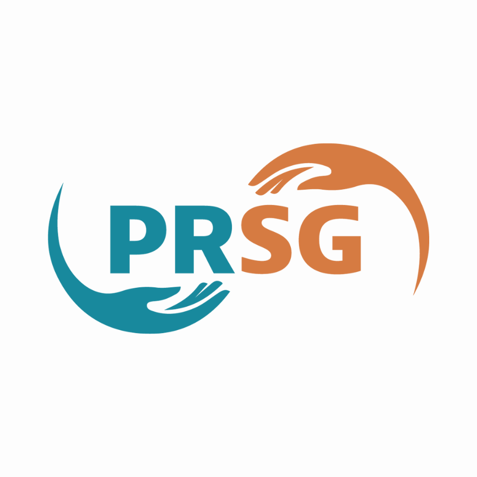
The New Logo: A Symbol of Inclusivity and Hope
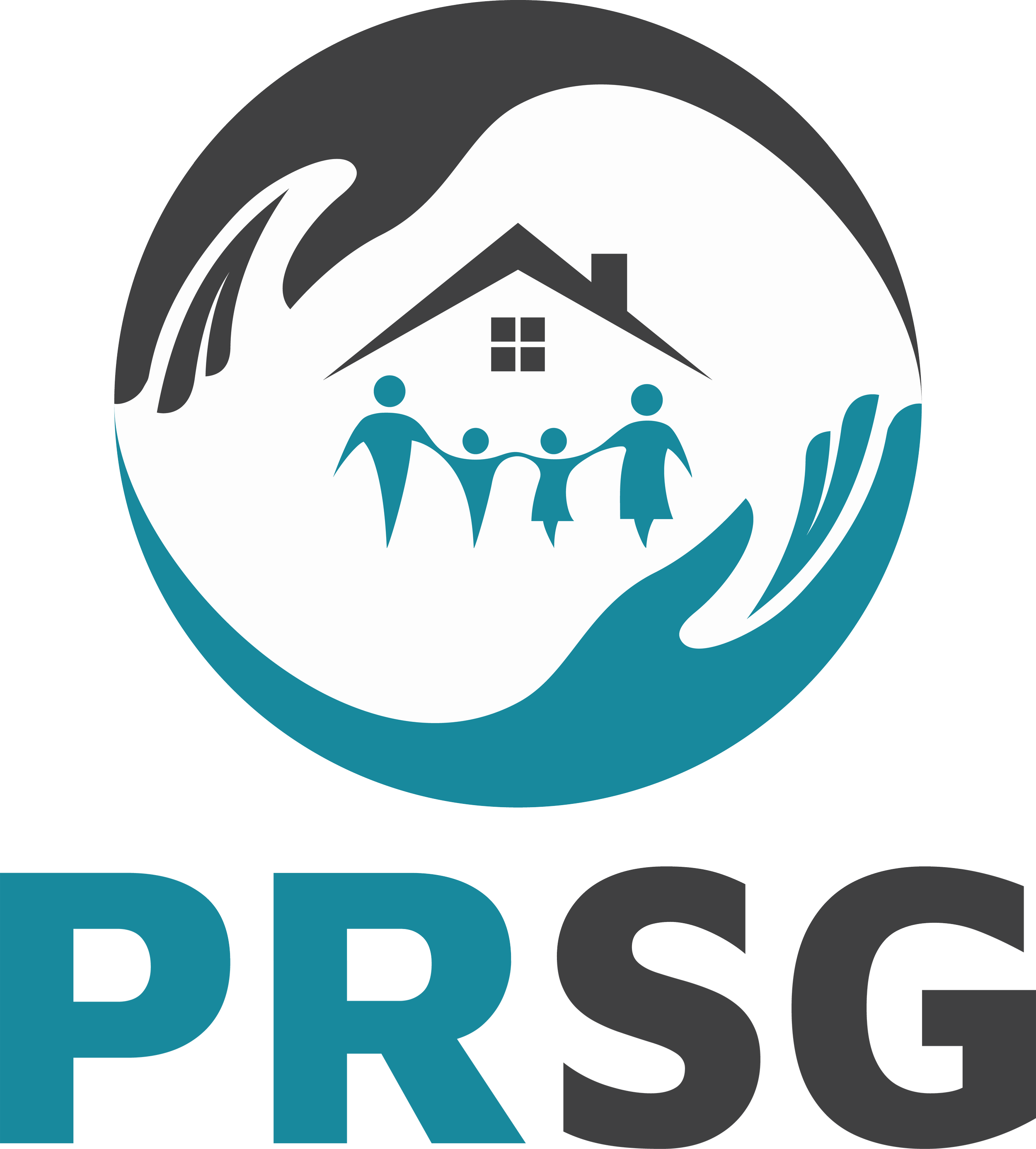
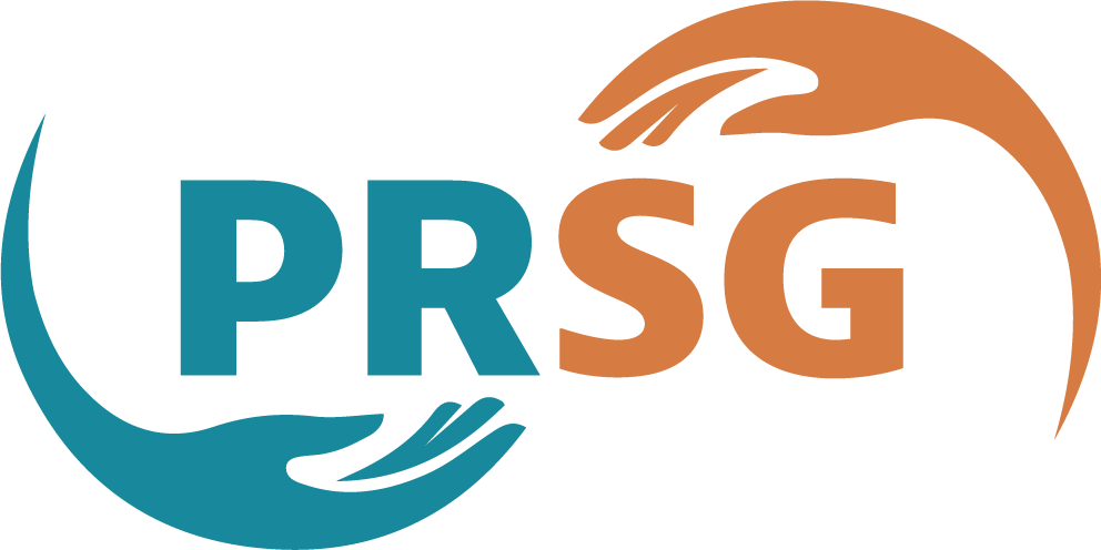
Retaining some elements of the previous branding, PRSG's new logo is a fusion of continuity and evolution. The teal blue color and abstract hands persist, but the shape has transformed into a more open design, symbolizing our unrestricted culturally-responsive approach. The blue teal hand with the palm facing upward represents the giving and caring hand, akin to a Pacific ocean wave, signifying the organization's aspiration to extend its support beyond Portland to the entire Pacific Northwest.
The bold letters of the organization's name are intentional, making it clear and easy to read to cater to a diverse audience. The use of two different colors for "PR" and "SG" aids in memorizing the order of the letters.
The orange caramel hand with the palm facing down symbolizes the protecting hand, mirroring the sun over the ocean and embodying the spirit of hope. When viewing the logo as a whole, an ‘♾️’ infinity symbol emerges, underscoring PRSG's commitment to providing limitless support to those in need.
A Commitment to Community
PRSG's commitment to the community is evident in its approach. The organization embraces everyone, asking not about their origins or reasons, but rather about their needs and aspirations. If the means are at hand, PRSG generously provides support. If not, the organization collaborates with individuals to find the resources they need, guiding them toward a path closer to their goals.
In conclusion, PRSG's brand refresh signifies more than just a visual makeover. It is a testament to the organization's dedication to growth, inclusivity, and making a lasting impact on the lives of community members. As the new brand identity unfolds, it not only reflects PRSG's present but also ushers in a promising future filled with warmth, hope, and unwavering support.